

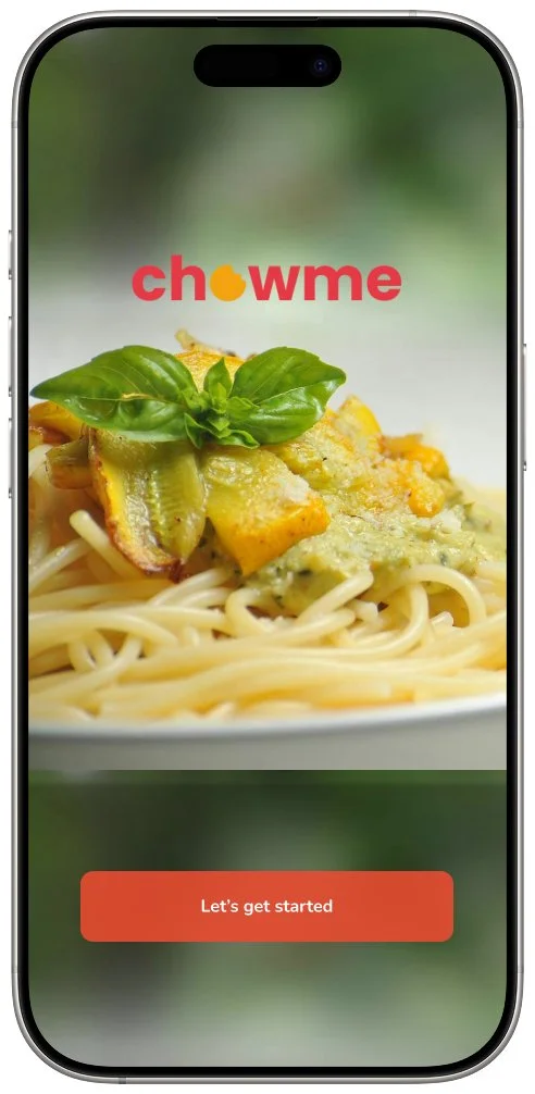
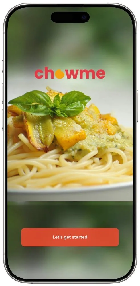
ChowMe
A UX design project that helps users discover and document their personal food journeys through a personalized and mood-based exploration experience.
End to End Responsive Mobile Design
Timeline : 10 Weeks
Role : Solo UX Designer/Research
Target Audience :
Users who enjoy eating out and discovering new places
Make dining decisions based on mood, cravings, or vibes
Often use platforms like Google Maps, Yelp, or Instagram for food inspiration.
Project Brief
A dedicated social platform that focuses solely on food experiences—like visiting new restaurants, exploring food cultures, and discovering new dining spots and saving their favorite dining experiences.
Research
To understand user behaviors, motivations, and pain points related to discovering and choosing dining experiences on digital platforms, and to identify opportunities for creating more intuitive, personalized, and engaging food discovery tools.
Research Objectives
Analyze how users search for and discover food experiences on social platforms (motivations, decision-making).
Understand triggers for seeking new food experiences and criteria for evaluating options.
Identify pain points and gaps in current platforms (Instagram, Yelp, TikTok) for food discovery.
Identify key motivations and contextual factors influencing food choices.
Discover opportunities to simplify decision-making and enhance user confidence in food choices
Research Methods
User Interviews
Conducted in-depth conversations with 8 target users to uncover their food discovery habits, preferences, and pain points.
Journey Mapping
Visualized the typical user’s path from craving a dish to trying a place or a dish, identifying key moments and frustrations along the way.
Personas
Created user profiles representing distinct food users to guide design decisions and prioritize features effectively.
Usability Testing
Tested both low-fidelity and high-fidelity wireframes with real users to validate design choices and improve overall usability.
Research Findings
TThe interviews aimed to understand how users discover, save, and interact with food-related content to inform the design of a dedicated food discovery and journey app.
The findings directly relate to the research questions by identifying user preferences, pain points, and motivations regarding food-related platforms and discovery without assuming any specific solution.
User Interviews
Personalized Restaurant Discovery
Offer tailored recommendations based on location, dietary preferences, and past interactions.
Advanced Search & Filters
Provide detailed filters for cuisine, location, trending dishes, dietary needs, and mood-based searches (e.g., "Best cozy cafes")
Personalized Feed
Create a “For You” section based on AI to personalize content similar to streaming platforms.
Food Diaries & Saved Lists
Allow users to create and organize private food diaries or saved lists for easy reference.
Niche Discovery Filters
Implement filters for vegan, hidden gems, budget-friendly places, and more.
Short Stories & Video
Integrate features for users to create short, engaging food stories or videos with editing tools.
Peer-Reviewed Recommendations
Enable peer reviews where users can mark content as helpful or trustworthy.
Organic Community Engagement
Build spaces for authentic, non-promotional content sharing, such as forums or local recommendations.
Journey Mapping
This journey map visualizes the end-to-end food discovery experience from the user’s perspective. It traces the path from initial inspiration (often sparked by social media or word-of-mouth) to deeper exploration, decision-making, and the actions that follow.
Key touchpoints include platforms like recipe blogs, review sites, and food apps.
The map highlights user thoughts and emotions throughout, along with common pain points such as overwhelming content, lack of personalization, and difficulty finding trustworthy recommendations.
These insights helped identify opportunities to design a more streamlined and tailored discovery experience—focused on simplifying the search process and improving the relevance of results.
Define
User Persona
This is Alex Carter, a 32-year-old foodie who represents our target user. He thrives on spontaneity when it comes to eating out and wants to make decisions quickly and confidently without diving into generic reviews.
Point of View Statement
Alex, a spontaneous foodie, loves discovering new restaurants but often finds the process overwhelming due to generic review platforms, decision fatigue, and a lack of personalized recommendations that match his mood, cravings, and dietary needs in the moment.
How Might We…
How might we create a seamless, real-time food discovery experience that helps users quickly find personalized dining options without the hassle of endless searching?

Sitemap
The structure emphasizes intuitive navigation, helping users quickly discover and explore food options based on what they’re craving—while also supporting a visually engaging and location-aware experience.
UserFlow
This user flow illustrates the key steps a user takes to discover a restaurant based on a specific dish they're craving. Starting from the Homepage, users can enter a dish name or explore via an interactive map. They can then refine their search with filters or mood-based shortcuts, browse personalized results, and dive into restaurant details like menus and reviews.
The flow supports decision-making with options to bookmark, get directions, or save a restaurant for later—before naturally looping back to the Homepage for continued exploration.
Branding

The name ChowMe combines:
“Chow” – a casual, inviting term for food
“Me” – placing the user at the center of the experience
This name mainly reflects the app’s core goal: personalized food discovery. It evokes a sense of fun and individuality, with interpretations like “Chow for Me,” or “Let’s Chow!”
Brand Values
Personalised Discovery - ChowMe tailors the experience to each user’s preferences — from cuisine types to mood-based categories — making food exploration feel relevant and exciting.
Joyful Navigation - With visually engaging layouts, interactive maps, and smooth onboarding, ChowMe ensures a seamless, delightful user experience.
Cultural Curiosity - ChowMe encourages exploration across diverse cuisines and food cultures, celebrating both popular trends and hidden gems.
Transparency & Trust - Clear labeling of reviews, visuals, and actions helps users make confident decisions when choosing what and where to eat.
Shared Experiences - Features like saving favorites, marking visited places, and food journaling allow users to create meaningful food memories.
Lo-Fidelity Wireframes
Sign Up screens
Key Feature
User Preference Setup - Users input and save cuisine preferences, dietary needs, and preferred price ranges.
Homepage screens - List View and Map View
Key Feature
Interactive Map with Food Spots - Displays nearby food spots with essential filters (mood, distance, and cuisine type)
Quick Mood-Based Filtering - Users select their dining mood (e.g., "Quick work lunch," "Cozy brunch") for tailored suggestions.
Specific Dish Search screens
Key Features
Search by Dish, Not Just Restaurant - Allows users to search for specific dishes like "Best ramen nearby" instead of just “Japanese restaurants.”
Save & track Lists – Users can create and track favorite restaurant or dish lists.
Lo-Fidelity Wireframe Testing
Hi-Fidelity Wireframes
This section showcases key high-fidelity wireframes that illustrate core user flows and personalisation features within the ChowMe app:
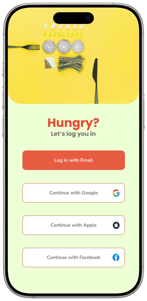
Sign In Screens:
Designed a streamlined onboarding experience that lets users sign up quickly or skip setup to start exploring immediately.
Homepage Screens:
Highlights core features like a craving-based search bar, mood-based categories, location-aware results, and a List/Map toggle for flexible browsing.
Favourites & My Eats:
Offers a personal space where users can save dishes/restaurants, track their dining history, and build a custom culinary journey — enhancing engagement and ownership.
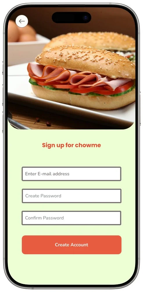
Sign up Screens
Designed a streamlined sign-up process allowing users to get started quickly and customise preferences at their own pace as many preferred to skip detailed setup and explore the app first.
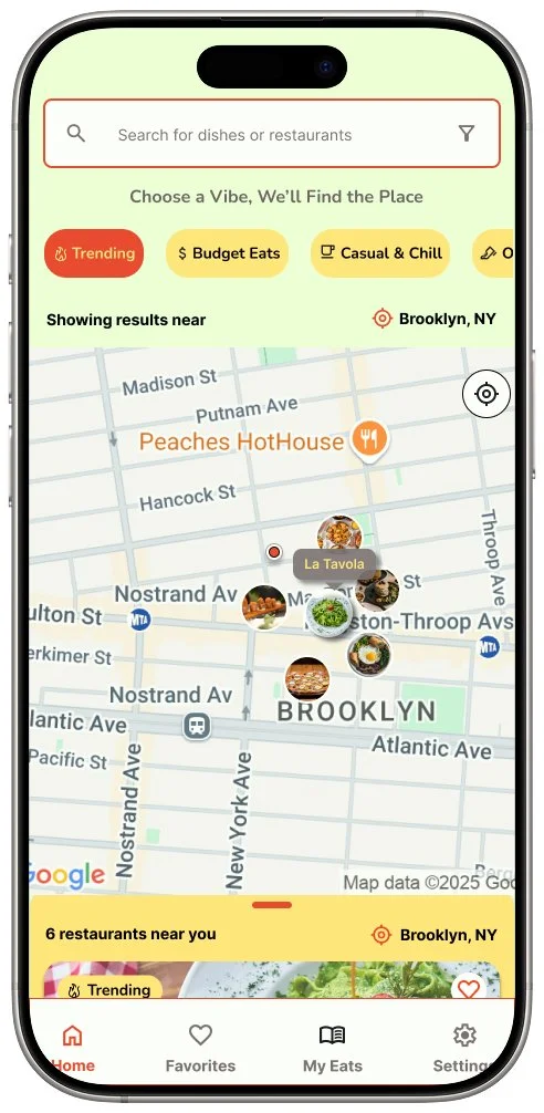
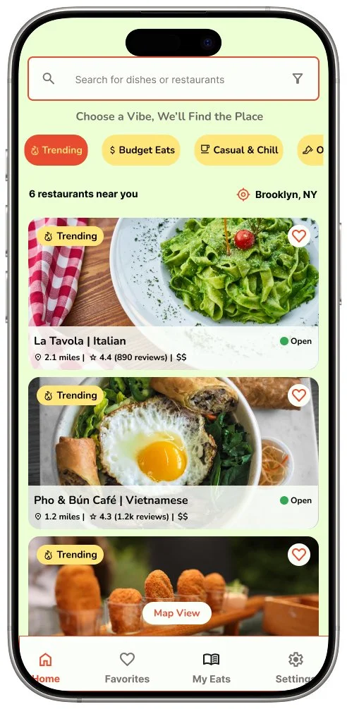
Homepage Screens
Key Features on the Homepage
Search bar:
Search for dishes or restaurants based on cravings.
Mood-Based CategoriesExplore places by vibe (e.g., “Romantic & Cozy,” “Budget Eats,” “Late Night Feels”).
Location Awareness: Restaurant results tailored to user’s current area.
List + Map View Toggle: Choose how to explore — spatial view or detailed list.
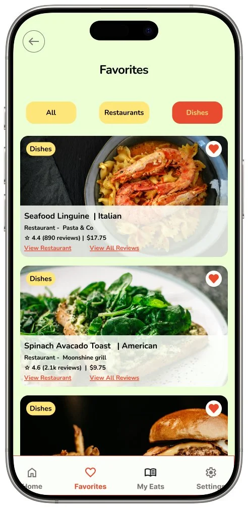

Favorites & MyEats Screens
Users appreciated having a personal space to save and revisit dishes and restaurants they enjoyed or want to try.
Favourites page allows quick access to saved items with a toggle between Dishes and Restaurants.
My Eats page acts as a culinary diary, showing user ratings, reviews, and “Tried on” dates to help recall past experiences.
Testing
Usability Testing
Test Objectives
The purpose was to evaluate the discoverability, usability, and clarity of the prototype’s
core features, including signing up, searching for dishes, filtering results, and saving or
marking visited places.
Features tested
• Onboarding & preference-setting during sign-up.
• Discovering places to eat using homepage, list & map views.
• Searching for specific dishes.
• Saving restaurants or dishes for later.
Key Findings & Iterations
Before
After


Favorites Screen Iteration
In the initial version, users toggled between “To Visit” and “Visited” within the same Favorites screen.
This mix created clutter and cognitive load, making it harder for users to distinguish between items they had tried and ones they wanted to try.
In the updated version, the Favorites page now focuses solely on wishlist items, while tried dishes have moved to a dedicated My Eats section.
This change was based on user feedback suggesting the need for better organization and separation between aspirational and completed food experiences.
Before
After


Dish Detail Screen Iteration
Users expected more visual elements (e.g. images, ratings, tags) to aid recognition and decision-making.
Dish and restaurant information were restructured for better clarity and grouping.
Added "Mark as Tried" button to increase interactivity and memory recall.
Improved layout of related dishes with consistent images, pricing, and ratings to encourage exploration.


“Mark as Tried” feature
“My Eats” screen
“My Eats” Screen Iteration
To address user needs around tracking food experiences, a new "My Eats" screen was introduced.
This screen showcases visited restaurants and tried dishes in one place — making it easy for users to reflect on and revisit past favorites.
Users can now mark a dish as “Tried” directly from both the dish detail page and the restaurant page, creating a seamless logging experience.
The design encourages users to rate and review dishes, adding a personal layer to their culinary journey.
This update helps complete the user's journey from discovering a dish to recording their experience with it.
Reflections
Main Insights from Research
Gained a deeper appreciation for user feedback loops — each round of testing brought unexpected insights that reshaped my assumptions.
Visual clarity was essential — Learned to prioritize clarity and hierarchy, especially when visual overload created user friction.
Became more confident in making design tradeoffs to support user goals while maintaining a clean UI.
Realized that design is a continuous journey, and it's okay if not everything is polished in the first round.
Takeaways for future projects
Early ideas might not land — but real feedback helps refine and evolve features into something more usable and relevant.
Reducing cognitive load by simplifying options (e.g., breaking out visited items) helped users focus and improved engagement.
Design for Delight, Not Just Function.
Be ready to pivot when user needs differ from initial assumptions — the best ideas often emerge during testing.